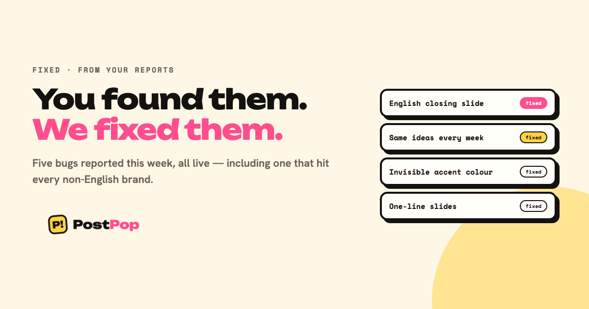
Every one of these came from a user. None came from us.
The closing slide was always English
A Polish brand reported a carousel in Polish with a final slide entirely in English. She was right, and the cause was worse than a translation miss: the closing card was never written by the AI at all. It was assembled in code from English text, along with the small labels down the side of every other slide.
Which meant it affected every non-English brand — every Turkish, German, Polish and Albanian kit on PostPop. One report fixed it for all of them.
The same three ideas, every week
Plan several weeks in a row and you got the identical three suggestions. Your brand's ideas are generated in a batch and cached; each new week then took the first three from that batch without checking what earlier weeks had already used.
"Swap idea" appeared to fix it only because swapping deliberately reaches past what was already shown. New weeks now skip what you have planned, and pull a fresh batch when they run out.
An accent colour you could not see
A tester said her slides looked flat — "just brand colours and a single line of text."
Two causes. The first: PostPop picked an accent colour that differed from the background but never checked it against the text. For a kit of white plus dark blue — which is most corporate websites — white landed in the accent slot while the text was already near-white. Contrast: 1.01. Every eyebrow, number, rule and highlighted phrase rendered in the same colour as the body copy, so the accent did nothing at all.
Two brand colours in, a flat two-colour deck out.
Slides with one line on them
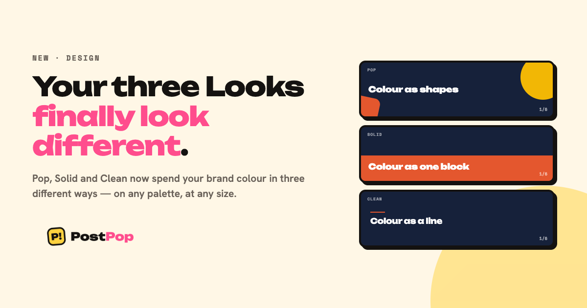
The second cause of the same complaint. The generator is told to write one to three full sentences per slide — 15 to 45 words. The check that catches thin slides only rejected bodies under eight words, so a nine-word body passed a test whose own instruction asked for fifteen. Exactly the single-line slides she saw.
Why we are writing this down
Because the pattern is worth more than the fixes. Not one of these was found by us. A cached idea list looks like working code from the inside; an accent colour that fails only on white-and-navy kits never shows up on ours.
If something looks wrong, tell us. It is usually not just you.